I begin by sketching. I make small rough sketches until I'm satisfied with something. Since one of the key elements of Frankenstein's monster is the set of neck bolts, I worried my painting wouldn't look right, so I thought I'd make some real neck bolts and mount them into the frame later.
Now I make a full scale drawing I will use as a reference guide. That's it. My preparation is all done and I'm ready to paint.
1. I lay a big blank white canvas on my drawing table. YIKES! That's intimidating!
2. Now I block in the base colors for the background. Normally now is when I would do the ground and sky. In this particular painting, since his face will fill the picture, there is no background, and the base color is just a single color. I found a sick, deadish green for his skin and coated the entire canvas.
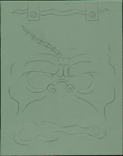
3. I draw my design on top of the base color. Sometimes I will just freehand a sketch right onto the canvas; other times, I use carbon paper to transfer a sketch I've drawn on another piece of paper. If I don't have carbon paper, I cover the back of the sketch with messy black pencil (just on the areas with drawing on the front face) and create my own carbon paper. I like to cut the paper the same size at the canvas if possible. If not, I put marks on the corners of the paper so I can align it with the canvas. Then I can repeatedly (and accurately) realign the drawing on the canvas multiple times. This is handy if I paint over my lines, and need to put new lines back on later.
I found a metal rod about 3/8" diameter and made a stylus shaped like a pencil for transfering with carbon paper. The stylus is just a little bit rounded on the tip so it doesn't tear the paper. I used to use a pencil, but it would put unwanted pencil lines on my sketch. Since I was transfering onto canvas, my pencil would tend to catch in the textured surface, and cause the pencil lines to look jagged and stair-stepped. I guess it's no big deal if the original sketch is destroyed in the process, but sometimes it's handy to be able to refer back to it when you've painted over your lines on the canvas. Also, if you transfer multiple times, your original sketch will evolve into something different than what you had originally planned, or it will disappear altogether under the blackness of pencil tracings.

4. I painted the base colors for his teeth and eyes: A Pale Yellow. That will be my "white" for this painting and I won't use anything brighter/lighter than this color in the entire painting.
With the base colors, they are what they are. There are no maybes or ifs. You don't really have a lot of options or choices with the base colors, so they are not intimidating. Right?

5. I painted the base colors for his head scar, gums, forehead brackets. To establish his face a little more (to get my bearings) I blocked in his nostrils and a big crack under the forehead brackets. Still not intimidating...yet.
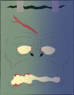
6. Now I want to establish the overall shape of the head. I want it to look cylindrical rather than spherical. I make a thin wash with blue and water. Almost equal parts, but a little more water than paint. It looks about the way blue milk would look if you could buy it at the grocery. I decided to give him cool (temperature-wise) shadows. Blue? Purple? Hmm, a choice popped up. I thought since his face is the only thing in the painting, blue would blend with green better than purple. I'll make the light source come from the upper left, so my shadow colors will be on the bottom and right side. I painted a wash of blue over everything on the right side, regardless of the base colors. The teeth and eye on the right side got washed over because they happened to be there in the way of my wash.
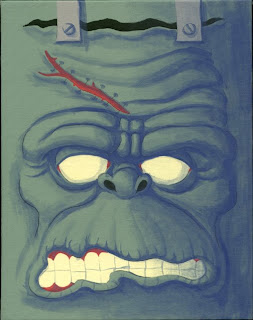
7. INTIMIDATION ACTIVATION PROCESS: ACTIVATE! I want to rough in what's happening. I use that same thin blue wash and very quickly rough in some shadows. I put shadows under the cheek bones, eyebrows, nose, skin folds, etc... This step is intentionally done sloppy and fast, just to get my feet wet. I don't worry about details yet. If accidentally I paint over highlight areas, I don't care. I can paint back over them with the base color again. I just want to break up the flat base color. These will be the midtones as far as shadows go. This step is intimidating for me because it's time for me to make choices; therefore I worry I'm making the right ones. After this step, I feel relieved and the rest goes pretty smoothly. (NOTE: Sometimes I will switch steps 7 & 8 around. It just depends on the painting I'm working on, and the mood I'm in.)
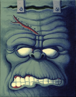
8. Now I mix the final shadow color. I don't water it down. I chose a Night Sky Blue, and I blocked in the big shadowy area on the right side. Then I dry-brush blended it into the Blue-wash shadow color. I put Night Sky Blue shadows under every protruding feature: eyebrow, nose, lip, etc... Then I put shadows in all the crevasses and wrinkles. Don't be afraid to let shadows meet other shadows. Don't individualize each shadow. In a real world, shadows overlap other shadows, and become twice as dark in the intersected areas. I like to squint my eyes and look at the painting. When I do this, I can see where I need to add more shadow color. There's less thought involved in this step than there was in the previous step. It is what it is. If it's an area opposite of the light, then it gets this Night Sky Blue shadow. I have no choice in the matter. I've just gotta do it. This Night Sky Blue represents blackness in this painting, and nothing should be darker. I don't use black.
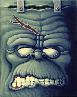
9. After the shadows are added, it looks almost done. I guess I could stop there if I wanted it to be low-key lighting. I'm not satisfied yet though. I want to add highlights. This step is always my favorite, and one of the most satisfying because it takes very little effort to hit the hight spots, and the results seem big. I mixed about half-and-half water with the same color I used for the whites of his eyes and teeth. Maybe a little more water. I made it look like yellow milk. After I hit all the top and left-side edges of everything, I used that same yellow paint, this time unthinned, straight out of the bottle, and did the extreme hard edges/bumps like the upward edges of the cut skin on his scar, the tip of his nose, the top edge of the lower eyelid, and the edge of his forehead bracket. Also, I used full-power unthinned yellow on the edges of the stitch holes in his scar and the edges of the pits on his forehead brackets. So now I've made yellow the "white" of this painting. There is no real white.
After I added the highlights, I looked at it again and felt like it wasn't dark enough in between the teeth, so I got the Night Sky Blue back out and worked his teeth over again.

10. The painting is mostly finished; it just lacks a few small details:
PUPILS:
- I usually do the pupils last on a face. I guess it's because it's fun to see the face come to life with the pupils, and if I do them early on, there are no more surprises for me.
- First, I pencil in the pupil locations.
- Then I use the Night Sky Blue and fill in the entire pupil circles. Let it dry.
- Then I choose an eye color: Light Blue.
- With the light blue, I painted the side of the pupil opposite of the highlight edge to give a dished-in appearance. Let it dry.
- Then I mixed a little of the highlight yellow and painted the middle of the Light Blue so it looked less flat and more gradiated. Let it dry.
- I put a small dot of Night Sky Blue in the center to create the iris opening. Let it dry.
- Lastly, I put a dot of highlight yellow on the hightlight side of the pupil to give the appearance of a domed eyeball lens.
BLOODSHOT EYE VEINS:
With my smallest brush, I made lines around the perimeters of the eye whites with the same red paint I used for the gums. I didn't do a lot because I didn't want to lose the big googly "white" eyeball effect. I want him to look sick, but not sickening. Too much red would look like he had pinkeye.
STITCHES:
- First I used Burnt Sienna as a base color to make stitch lines. Let it dry.
- Then I used the highlight color Pale Yellow to put evenly-spaced dots along the highlight edge of the stitches so they look like wound twine. Let it dry.
- After the stitches were finished, I used my Night Sky Blue (50/50 water/paint ratio) to make stitch shadows cast on the surface of his flesh.
- - The cast shadows on the skin are very near the stitches, so there's a little bit, but not too much offset from the stitches themselves.
- - Shadows inside the red meaty brain area, down inside the cut, are further away from the stitches, so they are more offset to create the appearance of distance in the shadow direction.
After I get the details finished, I give it a look, and squint my eyes, and look for any places I might need to add more highlight or shadows and fix those spots. Then I sign the bottom and it's done. YAY!
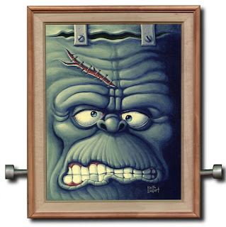
Well, almost done. I got a frame and put some neck bolts in it. (I wonder if that's a sentence where those particular words have never been strung together exactly like that in the history of the English language.)



No comments:
Post a Comment